
The Power of Typography in Design
Why Typography Matters
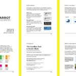
Typography plays a key role in design but is often overlooked. The way we arrange and combine letters can greatly influence how a project is seen and felt. In this article, we explore typography’s impact on design and the value of pairing fonts for harmonious and effective results.
Understanding Typography’s Role
Typography goes beyond simply picking a font. It’s a crucial part of visual communication that affects the readability, structure, and overall look of a design. When used well, typography can:
- Make Text Easy to Read: Clear and easy-to-understand text is important for getting your message across. A well-planned layout helps viewers navigate and comprehend content.
- Organize Information: Typography helps create a visual structure, guiding the viewer’s eye and emphasizing key points. This is done by adjusting font size, weight, and style.
- Convey Emotion: The choice of font can express a mood or feeling that matches the design’s purpose. A playful font suggests fun, while a more traditional one implies professionalism.
- Strengthen Branding: Consistent typography helps reinforce a brand’s identity and creates a sense of unity across various platforms and media.
The Power of Font Pairings
Font pairings are a vital part of typography, as they create a balance between different fonts in a design. By thoughtfully combining fonts, designers can:
- Add Variety: Mixing fonts with different weights, styles, or types can create visual contrast, adding depth to a design.
- Create Harmony: Effective font pairings ensure that the design feels unified and visually appealing.
- Improve Readability: Fonts that work well together in terms of legibility can enhance the readability of the text, making it easier for the viewer to process the information.
- Highlight Important Details: Font pairings can draw attention to specific parts of a design, such as headings, subheadings, or call-to-action buttons.
Strategies for Font Pairing
Designers can use several techniques when choosing font pairings for their projects. Some popular methods include:
- Serif + Sans Serif: This timeless combination provides contrast and harmony, making it a reliable choice for many projects.
- Script + Sans Serif: Pairing a script font with a simple sans serif typeface adds elegance and energy while maintaining readability.
- Slab Serif + Sans Serif: This duo creates a striking visual structure and works well for projects that demand attention.
- Display + Sans Serif: Combining a decorative display font with a simple sans serif typeface results in eye-catching designs that captivate viewers.
- Modern Serif + Sans Serif: This pairing offers a fresh, modern look while ensuring excellent readability and a balanced feel.
In Conclusion
Typography is vital for a design’s success, and understanding font pairings can take your projects to the next level. By mastering the art of combining fonts, you can create engaging designs that connect with your audience and communicate your message effectively. As you continue to explore typography, experimenting with different pairings will reveal the true potential of harmonious and impactful font combinations in your designs. If you would like to learn more to further develop your skills, consider enrolling in the “Typography for Designers & Developers” course on Udemy: https://www.udemy.com/course/typography-mastery-for-ui-designers-and-developers/.