Behind the Screens: Print vs Digital Colors
In the ever-illuminated world of design, there’s a hidden puzzle that many of us grapple with – the mysterious shift of colors from our screens to the printed page. It’s like a chameleon changing its hues, where the brilliant emerald green on your computer screen can mysteriously mellow into a gentle forest green on paper. Some color trickery afoot, you wonder? Well, let’s unpack this spectrum mystery and dive into the riveting world of Pantone, CMYK, and RGB – the primary protagonists of our tale.
Precision in Print: Pantone Colors
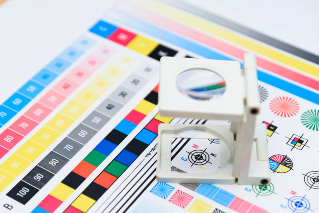
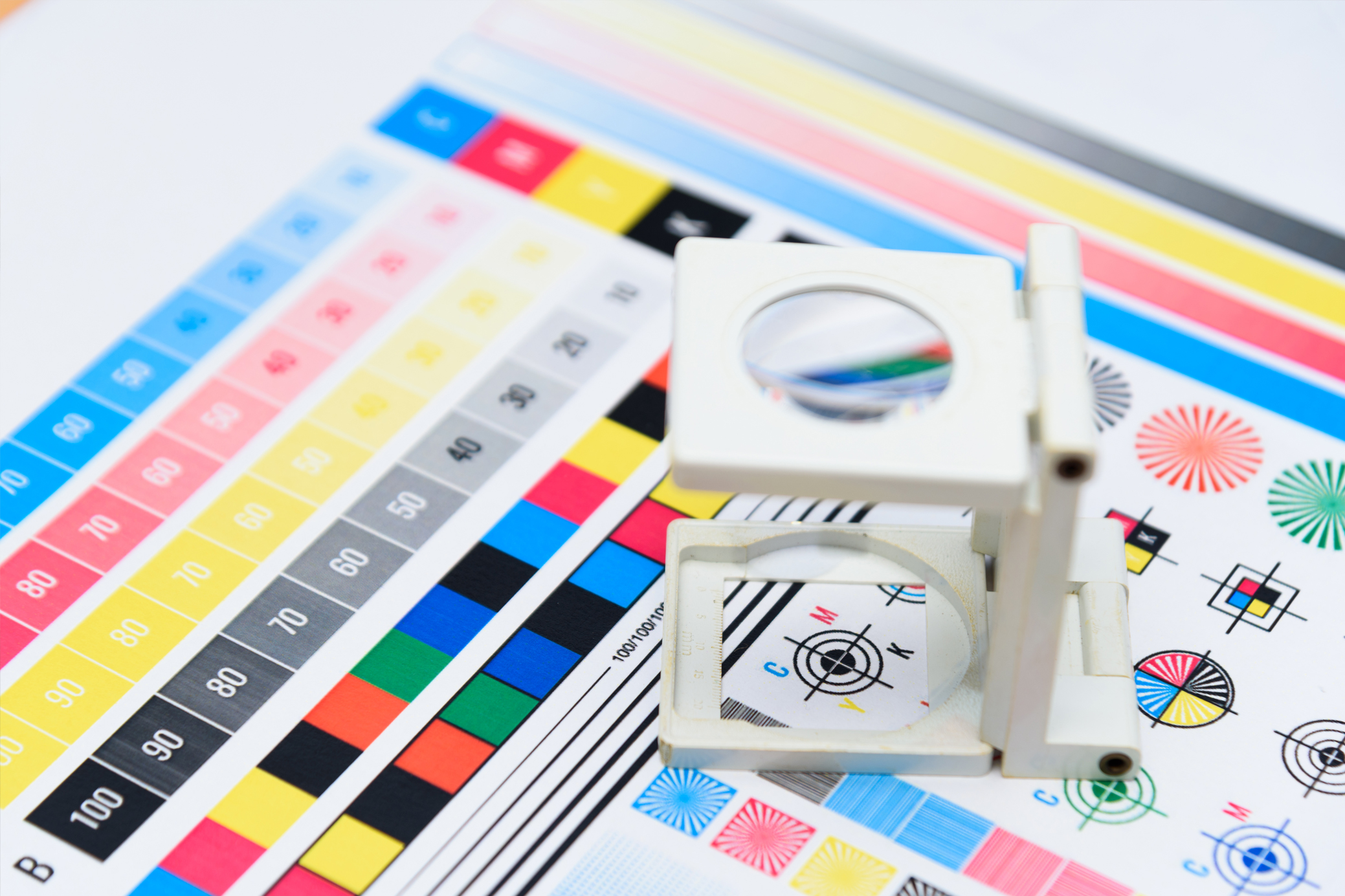
Pantone Colors, the discreet operatives in the printing world, employ a robust system of color codes to deliver precision and consistency. Every color code represents a unique shade, crafted from a Spot Color formula that blends 18 base colors in various proportions. Think of Pantone as a seasoned artist with a keen eye for detail, capable of mixing the perfect ‘sunrise pink’ or ‘deep sea blue’ with ease. The Pantone Matching System (PMS) includes over 1,800 distinct colors, providing a vast palette for exact color reproduction.
Color’s Digital Quartet: CMYK Colors
In the digital printing universe, the CMYK color model emerges as a vibrant quartet comprising Cyan, Magenta, Yellow, and Black. The color codes in CMYK are based on percentages (0-100%) of these four colors. For instance, a bright red might be represented as 0% Cyan, 90% Magenta, 80% Yellow, and 0% Black. This system operates on a “subtractive” process – the more colors you mix, the darker the result. Picture this as stacking layers of tinted glass: the more layers you add, the less light passes through, and the darker the resulting color appears. It’s a delicate balance, but CMYK has mastered this color dance.
Illuminating Pixels: RGB Colors
Our digital displays owe their vibrant colors to RGB – the Red, Green, and Blue lights that bring images to life on the screen. RGB color codes are typically defined by a three-number value, each representing the intensity of red, green, and blue (ranging from 0 to 255). For instance, pure white is [255, 255, 255], while [0, 0, 0] gives us absolute black. However, each monitor’s unique calibration and brightness settings can cause color variations across devices, much like the ever-changing colors of a chameleon adapting to its environment. With RGB, your understanding of these subtleties can help you paint the perfect digital picture.
When Worlds Collide: Print vs. Screen
Ever unboxed a freshly printed marketing piece only to find it’s not the masterpiece you admired on your screen? That’s because print follows the Pantone or CMYK rhythm, while your computer screen grooves to the RGB beat. To avoid such chromatic misadventures, it’s essential to consider your final presentation medium and use the appropriate color profile during design. Alas, common programs like MS Word, PowerPoint, and Keynote aren’t quite up to this color tuning task, but fear not, design virtuosos like Adobe InDesign, Photoshop, and Illustrator are ready to step in.
Maintaining Color: Brand Guide Essentials
One surefire way to avoid a color catastrophe is by creating a Company Branded Guideline – think of it as a color map for your business. This guide should be the touchstone for all your brand elements – logos, color palettes, photography, illustrations, icons, and typefaces. Remember, in the realm of design, consistency is not just key, it’s king.
We understand that crafting a comprehensive Brand Guide can feel like traversing uncharted territory, which is why we’ve put together a handy blog post detailing the importance of a Brand Guide. You can check it out HERE for more insights. Should you need further assistance in creating your own Company Branded Guidelines, or any other design queries, don’t hesitate to reach out. After all, we’re more than just a printing company; we’re your partners in design, and we’re always here to listen!
#PantoneColors #CMYK #RGB #ColorConsistency #BrandGuidelines #DesignTips #PrintDesign #DigitalDesign #nSymbio
