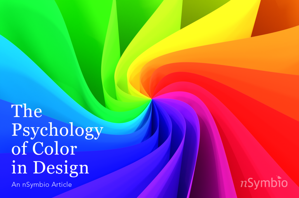
The Psychology of Color in Design
Color is everywhere. It’s a universal language, transcending borders and dialects. It’s more than a visual treat – it’s a crucial part of our existence. Color has the ability to stir our emotions, evoke memories, and trigger our reactions. It can cool our senses with its soft shades or electrify us with its bright tones. Just like notes in a song, each color adds its unique sound, stirring emotions, shaping our feelings about the design.
Color’s Influence on Perception
Colors subtly shape our choices and behaviors, leaving a lasting impact. It could be an attention-grabbing orange label enticing us to try a new product, a calming green packaging hinting at sustainability, or a classy black and gold combo speaking luxury and elegance. Let’s look into the intriguing world of color in design. Let’s understand how it affects our perceptions, influences our emotions, and nudges our behavior.
Decoding Colors
Unraveling the complex language of color can be a fascinating journey. Each hue carries a world of meaning and emotion, influencing how we perceive and interact with designs. By understanding what each color communicates, we can use them more effectively in our designs to elicit specific reactions and create a desired atmosphere. Let’s explore the psychology behind some commonly used colors.
- Red: Symbol of energy and passion, red stimulates the senses, raising heartbeat and blood pressure. It’s used in design to attract attention or evoke feelings of excitement.
- Blue: Reflects calm, stability, and reliability. It promotes feelings of trust and productivity, making it a common choice for corporate designs.
- Yellow: A sign of optimism and energy, it can stimulate feelings of happiness and creativity. However, it’s also used to signal caution.
- Green: Signifies nature, growth, and harmony. It’s ideal for designs related to the environment and finance.
Color Across Cultures
When crafting a design, the audience’s cultural background matters. Color carries varied meanings across cultures, making cultural sensitivity crucial in effective design. For instance, white symbolizes purity in Western cultures and is often seen at weddings. However, in Eastern cultures, it’s symbolic of mourning and death, commonly used in funerals.
Color and Brands
Color is a potent tool that brands use to distinguish themselves and influence public perception. It plays a pivotal role in shaping a brand’s identity, making it more recognizable to its target audience. Consider IKEA, for example. It uses a combination of blue and yellow in its logo. Blue symbolizes IKEA’s commitment to providing reliable products, while yellow mirrors the comfort customers seek in their home furnishings. On the other hand, Marvel uses a bold red in its logo. The color perfectly embodies the thrilling superhero narratives that Marvel is known for.
While colors can help in shaping a brand’s image, it’s important to remember that consistency is key. A brand must consistently use its chosen colors across all platforms and mediums. This consistent use of color helps in reinforcing the brand’s identity, making it more familiar and reliable to its audience. For more information about brand identity, please read our article on The Importance of a Brand Guide.
Conclusion
The psychology of color in design reveals the complex relationship between color and human perception. Each color carries its own set of associations and cultural nuances, making them powerful tools in the hands of designers. Yet, color psychology is not an exact science and can be influenced by personal experiences and cultural backgrounds. While certain colors may evoke specific emotions or convey particular meanings, individual responses can vary. As designers, it’s essential to consider the objectives of the design, the target audience, and the desired emotional response. By harnessing the power of color, designers can create captivating experiences that resonate with and engage audiences on a profound level. So, let’s embrace the world of colors, explore their possibilities, and craft designs that not only catch the eye but also evoke meaningful emotions.
