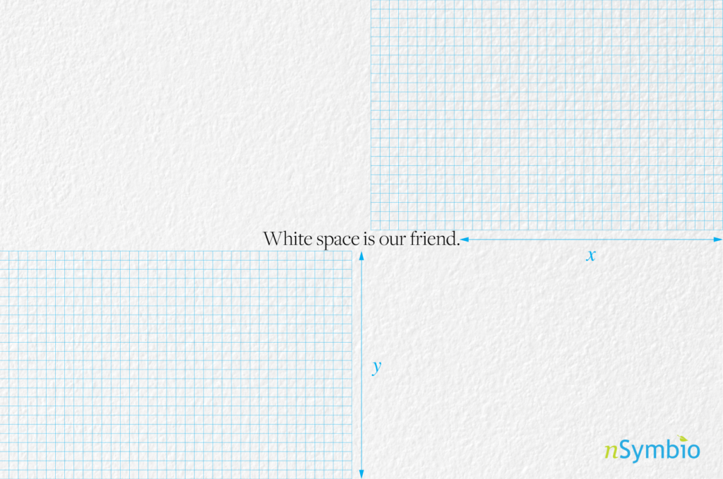
Embrace the Emptiness
White Space in Design
White space, also known as negative space, plays a vital role in design, despite its unassuming nature. It refers to the empty areas surrounding and within design elements. In this article, we’ll explore the significance of white space in creating visually appealing and effective designs. Let’s discover how using white space correctly can elevate your design game.
The Essence of White Space
White space is the ‘breathing room’ in a design. It helps establish a sense of balance and organization by providing separation between elements. Think of it as the pauses between words, the silence between musical notes, or the gaps between objects in a room. By strategically incorporating white space, designers can create a harmonious and pleasing visual experience for the viewer.
Enhancing Visual Appeal
One of the remarkable qualities of white space is its ability to enhance visual aesthetics. It brings clarity and simplicity to a design, allowing key elements to shine. For instance, let’s look at Apple’s design philosophy. They have masterfully incorporated white space in their product designs. By embracing simplicity, Apple creates a sense of elegance and sophistication that has become synonymous with their brand. The generous use of white space in their user interfaces and advertising materials highlights the essential features and elevates the overall user experience. It’s a testament to how effective implementation of white space can result in visually appealing designs that stand the test of time.
Improving Readability and Comprehension
White space plays a crucial role in making content more readable and understandable. It provides breathing space for text, making it easier for readers to navigate through paragraphs and absorb information. By increasing legibility, white space minimizes cognitive strain and enhances comprehension. It’s like turning a dense block of text into bite-sized, easily digestible portions.
Guiding the Viewer’s Focus
White space acts as a silent guide, directing the viewer’s attention to key design elements. It helps establish visual hierarchy, enabling viewers to quickly identify and engage with important information. By giving ample space around focal points such as headlines or call-to-action buttons, designers can effectively guide the viewer’s focus and improve the overall user experience.
Get the Balance Right
Finding the right balance with white space is crucial. Too little can result in a cluttered and overwhelming design, while too much can make it feel sparse and unfinished. Achieving the perfect equilibrium requires a mindful approach and experimentation. Designers must strike a harmonious balance to ensure that white space enhances the overall composition rather than dominating it.
Applying White Space in Practice
When working with white space, designers can follow a few practical guidelines:
- Use a grid system: Grids provide structure and help distribute white space consistently throughout a design.
- Establish contrast: Contrast between elements and white space creates visual interest and draws attention.
- Room to breathe: Leave sufficient space around text and images to improve readability and allow visual elements to stand out.
- Think responsive: Consider how white space adapts across different screen sizes and devices to maintain a harmonious design.
- Trust your instincts: Experimentation and practice are key. Embrace white space as a valuable tool and let your intuition guide you to find the right balance for each design project.
White space, the unsung hero of design, has the power to transform a design from ordinary to extraordinary. By embracing the emptiness, designers can create visually pleasing, balanced, and impactful compositions. So, let’s embrace the simplicity and elegance of white space, and allow it to work its magic in our designs, reminding us that sometimes, less truly is more.


